Scorched Media Web Design Portfolio – Peppermint Care
The Client
Peppermint Care is a Brisbane-based provider offering aged care, NDIS, and veteran home care services. They focus on delivering compassionate, personalised care to clients in their homes.
Project Overview
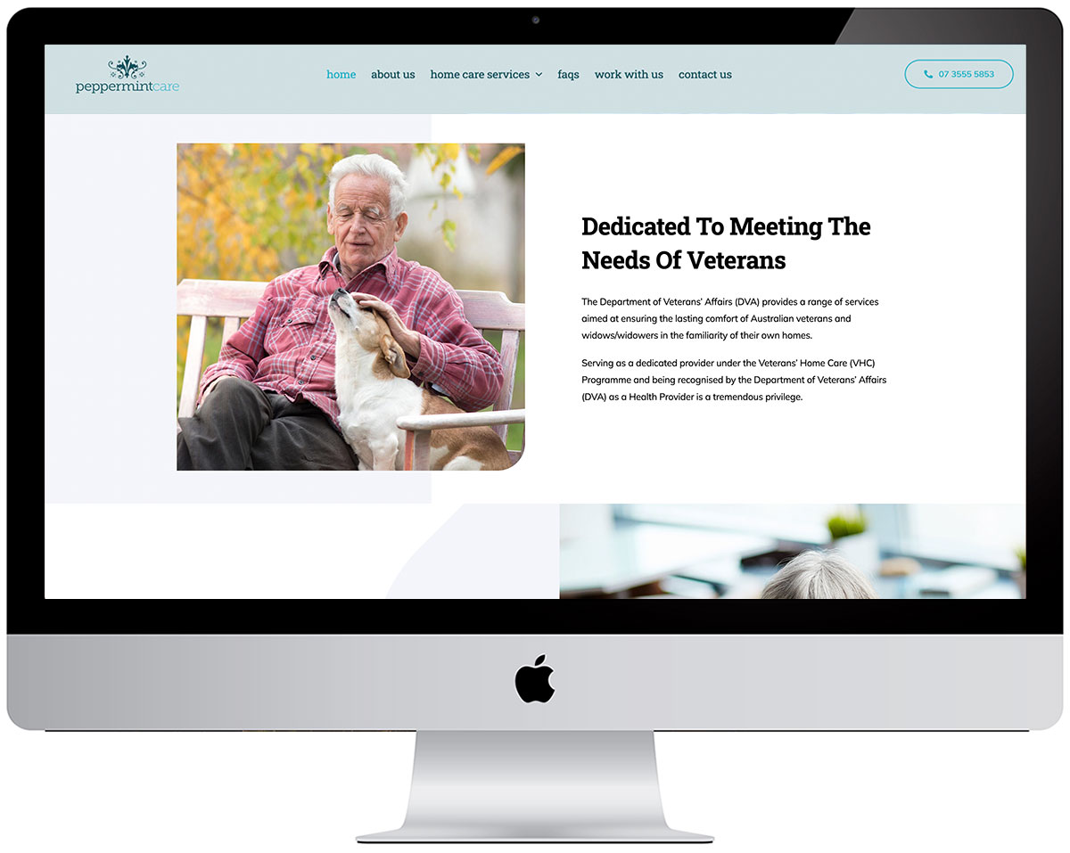
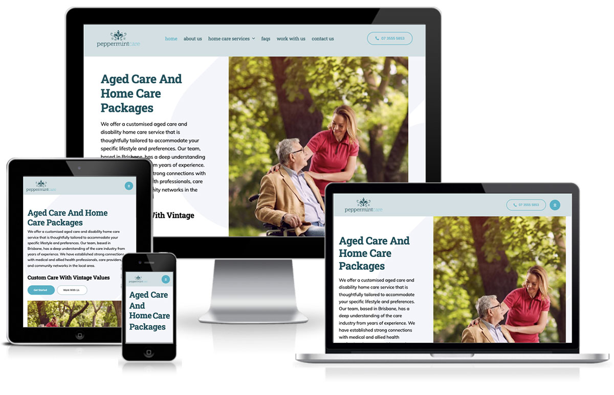
The Peppermint Care website was designed to create a professional, clean, and approachable online presence that reflects the core values of care, trust, and compassion. The website uses a calming colour palette and minimalistic layout to instil confidence and offer a user-friendly experience that makes navigation easy for potential clients. By ensuring a fully responsive design, the website delivers seamless functionality across all devices, from desktops to smartphones, providing a consistent experience for every visitor.
Modern, Professional Aesthetic
The design embodies the compassionate care offered by Peppermint Care, with a layout that prioritises simplicity and ease of access to critical information. The combination of light colours and clean lines creates an environment that is both welcoming and professional, helping to build trust with site visitors. The layout is structured to lead users naturally through the site, guiding them to explore services, contact information, and client testimonials with ease.
User-Centric Navigation
The user experience is enhanced by clear, intuitive navigation, with services and key information placed front and centre. This ensures that visitors can easily access the information they need, whether it’s about specific care services or how to get in touch. The sticky navigation bar at the top of the page ensures that important sections of the site are always just a click away, regardless of where a user is on the page.
Engagement-Boosting CTAs and Conversion Elements
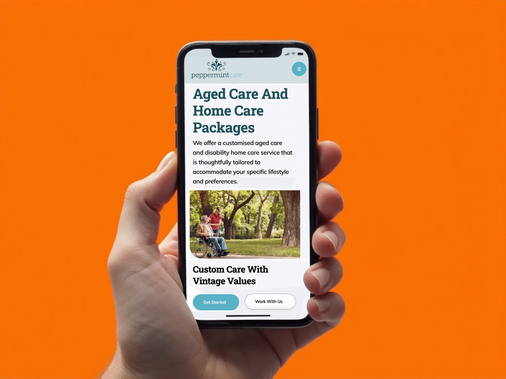
Strategically placed Call-to-Action (CTA) buttons throughout the Peppermint Care website encourage potential clients to take the next step, whether it’s reaching out for more information or booking a consultation. These CTAs are designed to be highly visible and action-oriented, guiding visitors towards direct engagement with the company.
- “Contact Us” and “Book a Consultation” Buttons: These CTAs are integrated into key sections of the website to make it easy for users to get in touch with the Peppermint Care team. By placing these buttons prominently at the top of the homepage and in the service sections, the site ensures that visitors are continually prompted to take action.
- Subtle Callouts Throughout: The design also includes subtle callouts that prompt visitors to learn more about the company’s services. These serve as an additional touchpoint to drive engagement and encourage potential clients to explore more in-depth content about the care offered by Peppermint Care.
Responsive and Mobile-Friendly Design
With an increasing number of users accessing websites on mobile devices, the Peppermint Care website was designed to be fully responsive. The layout adapts seamlessly to all screen sizes, ensuring that the user experience remains intuitive whether viewed on a desktop, tablet, or smartphone. The mobile-optimised design ensures that the CTAs, navigation, and content are all accessible and functional across various platforms, making it easy for users to engage no matter where they are.
Optimised for SEO and Lead Generation
The site was also developed with SEO best practices in mind. From the structure of the content to the placement of keywords, every aspect of the website was optimised to improve search engine visibility and attract relevant traffic. The inclusion of service-specific pages with targeted keywords ensures that Peppermint Care ranks well for local searches related to care services, driving qualified traffic to the site.
By incorporating SEO-friendly elements, the site is positioned to generate leads through organic search, while providing a clear path for visitors to convert into clients through strategically placed CTAs and clear, informative content
